

What a Pantone spot colour is
Most print is made from four process inks: cyan, magenta, yellow and black (CMYK). Every colour in a photo or a full-colour design is built from tiny dots of those four. A spot colour works differently. It is a single ink, mixed to a specific recipe before it goes on the press, and printed as a solid colour of its own.
The most widely used system for naming spot colours is the Pantone Matching System. Each colour has a number and a suffix, such as "Pantone 286 C". When you specify a Pantone colour, you are telling the printer which premixed ink you want, rather than asking it to approximate a colour from CMYK.
That sounds like the obvious choice for a brand colour, and sometimes it is. But spot colours change how a job is printed, how much it costs and how you must set up the file. This guide explains when specifying Pantone makes sense in an online order and how to set up swatches so the printer gets exactly what you mean.
C, U and why the same number looks different
The suffix after a Pantone number refers to the paper it is shown on. "C" means coated paper and "U" means uncoated. The ink recipe is the same, but uncoated paper absorbs more ink and scatters light, so the colour looks softer and slightly darker. A Pantone 286 on a gloss brochure and on an uncoated letterhead will never look identical.
Choose the version that matches the stock you are ordering. If you order uncoated business cards and approve a "C" swatch on screen, expect a difference. If you need a colour to look the same across both, you may have to choose a different Pantone for each stock, and your printer can help you compare them with a physical swatch book.
When a spot colour is worth specifying
- Strict brand colours. Some brand colours, particularly bright oranges, greens and some blues, fall outside what CMYK can reproduce. A spot ink hits them; CMYK gets close but visibly duller.
- Large flat areas. A solid background in a spot ink is smooth and even. The same area in CMYK is made of dots and can show slight variation.
- One- and two-colour jobs. Letterheads, envelopes, simple stationery and some packaging are often printed with one or two spot inks and no CMYK at all.
- Special inks. Metallic and fluorescent colours exist only as spot inks. They cannot be simulated with CMYK.
- Consistency across reprints. A mixed ink to a known recipe tends to stay closer from run to run than a CMYK build, which can drift with press conditions. Our article on why a reprint does not match the last batch explains the usual causes.
When CMYK is the better choice
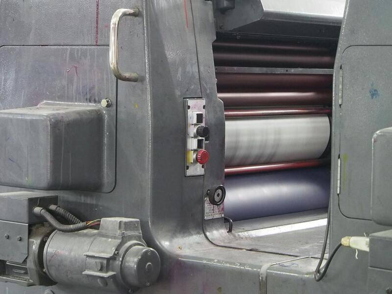
Spot colours are not free. Each one usually means an extra plate and an extra ink unit on an offset press, plus make-ready and wash-up time. On short runs that cost per copy adds up quickly.
There is another catch for online orders: many online print products run on digital presses. A typical digital press prints CMYK toner or ink and does not load a separate Pantone ink. It will simulate your Pantone by converting it to the closest CMYK mix. For many colours the result is fine. For colours outside the CMYK range it will not match a swatch book. Some digital presses use extra colours to reach a wider range, but that is not something to assume without asking.
If you are ordering a short run of flyers, a full-colour brochure with photos or anything already printing CMYK, it is usually simpler to build your brand colour in CMYK and accept a close match. Pantone publishes a guide (often called Color Bridge) that shows each spot colour next to its suggested CMYK equivalent, which helps you judge how close the conversion gets.

How to set up Pantone swatches in your print file
Most colour problems with spot jobs come from the file, not the press. A few rules prevent nearly all of them.
Use the library swatch, not a typed name
In Illustrator, InDesign or Affinity, add the colour from the Pantone library in your software so the swatch is defined as a spot colour with the correct name. Typing "Pantone 286" into the name of a CMYK swatch does not make it a spot colour.
Keep one swatch per colour
A file that contains "PANTONE 286 C", "Pantone 286 C" and "PMS 286" will separate onto three different plates. Merge duplicates before you export. This often happens when logos are pasted in from different sources.
Decide what stays spot and what converts
If your job is CMYK plus one Pantone, only that colour should remain spot. Photos and other colours must be CMYK. If the whole job is being printed digitally in CMYK anyway, tell the printer whether you want the spot colours converted by them or by you. Do not leave it ambiguous.
Check tints and overprint
Spot colours can be used as tints, such as 40 percent of your Pantone, which prints as a lighter dot pattern of the same ink. Check that any overprint settings are intentional; an accidental overprint on a spot colour can change how it mixes with what is underneath. Our guide to transparency, overprint and flattening covers this in more detail.
Checking your PDF before you upload
Open the exported PDF in a reader with an output preview or separations panel. You should see exactly the inks you expect: four process plates plus one plate per spot colour, or only the spot plates for a one- or two-colour job. Any extra plate means a duplicate swatch or a stray element. Our walkthrough on exporting a print-ready PDF shows which export settings keep spot colours intact, and the earlier article on spot UV, foil and white ink separations uses the same separations check for finishes.
What to write in the order notes
An online order form does not always have a field for spot colours. Use the notes box and be specific:
- the exact Pantone references, including C or U;
- whether they must print as spot inks or may be converted to CMYK;
- which element matters most if the colour has to be matched by eye, for example the logo;
- whether you have a previous printed sample the printer should match.
If colour accuracy really matters, ask for a hard proof or a short sample run before the full order. Screens cannot show spot colours reliably, even when calibrated.
Printing Pantone colours with ePrintingService
We print both ways. Offset jobs can run true spot inks, including metallics, and our digital work converts spot colours using press profiles so the CMYK result lands as close as the colour allows. During prepress we check every file for duplicate swatches, stray spot plates and colours that will shift noticeably on your chosen stock, and we tell you before printing if a Pantone will not convert well.
Not sure whether your brand colour needs a spot ink or will be fine in CMYK? Send us the Pantone reference and the product you plan to order. You can read more about our colour printing services or contact us for advice and a quote.
