
The difference that matters at the press
A vector file stores shapes as instructions: this curve, that thickness, this colour. A raster file stores a grid of coloured squares. Scale a vector logo to the side of a lorry and the press redraws every curve at full sharpness. Scale a raster logo the same way and you get the same squares, larger, with soft edges where crisp ones should be.
That single behaviour explains most file problems that reach a print shop. Nothing about a raster file looks wrong on screen, where the browser smooths everything and you are viewing at a fraction of print size. The softness only appears when the sheet comes off the press, by which point the run is done.
Common vector formats are AI, EPS, SVG and PDFs exported with the artwork left as live shapes. Common raster formats are JPG, PNG, TIFF and PSD. A PDF can hold either, or both, which is why "send a PDF" is useful advice but not a complete answer.
What vector handles best
Logos and brand marks
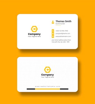
A logo is the one asset that has to work at every size you will ever print, from a 6mm favicon-sized mark on a name card to a two-metre banner. Keeping the master as vector means one file serves both. If your logo exists only as a PNG pulled from a website, it is worth having it redrawn once rather than working around it on every job.
Type, line art and diagrams
Text set as live type or converted to outlines prints with clean edges at any size. The same text saved as a JPG picks up compression artefacts around every letter, visible as a faint grey halo on the printed sheet, and worse on uncoated stock where the ink spreads slightly. Technical drawings, floor plans, maps and icons all belong in vector for the same reason.
Anything that needs an exact colour
Vector objects hold a defined colour value, including a named Pantone. A raster image holds millions of slightly different values, and a flat area that should be one brand colour often is not, particularly after a JPG has been saved a few times. When a colour has to match across a stationery set, keep those elements vector.
What raster handles best
Photographs are raster by nature and there is no advantage in trying to change that. So are scans, textures and anything with soft gradients between many colours. The rule for raster is not the format but the resolution: 300dpi at the size the image will actually print.
That last part is where people slip. A 300dpi image is only 300dpi at its native dimensions. Place a 300dpi photo at three times its size on a poster and it is now printing at 100dpi, which looks soft at reading distance. Check the effective resolution in the layout, not the file properties.
For photographs, supply TIFF or a high quality JPG. PNG is fine for screen work and for images that need transparency, though it is not the natural choice for print photography. Avoid anything that has been through a messaging app, since those recompress images aggressively and there is no way to recover the detail afterwards.
The mistakes that cost a reprint
- A vector file with a raster logo dropped inside it. The file is technically an EPS, the logo inside is a screengrab. It still prints soft.
- Enlarging to fix resolution. Resampling a small image upwards adds pixels but no detail, and usually adds visible smearing along edges.
- A logo saved as a JPG with a white box. JPG has no transparency, so the mark arrives with a white rectangle that shows against any coloured background.
- Screenshots as source art. A screen capture is 72 or 96dpi by definition. Nothing done afterwards makes it printable at size.
- Outlined type with no editable copy kept. Outlining is right for supply, but keep a version with live text so a phone number can be corrected without redrawing letters. The reasoning is in fonts in print files.
- RGB images in a CMYK job. Bright screen greens and blues have no ink equivalent, so they convert to something duller. Better to see that in a proof than on delivery.
How to tell what you are holding
Open the file and zoom in hard, to 800 percent or more. Vector edges stay sharp at any magnification. Raster edges break into visible squares. In a PDF, use the selection tool: if you can click an individual shape or letter and see its anchor points, that part is vector. If the whole page selects as one block picture, it is raster.
File size is a rough hint as well. A logo that is 40KB is almost certainly vector. The same logo at 4MB is a large raster image that will still be soft if it is placed larger than its native size.
Getting a vector version when you do not have one
Plenty of small businesses own their logo only as a JPG or a PNG, because the person who made it left, the agency closed, or it was drawn in a tool that exported pictures. This is fixable, and it is worth fixing once rather than fighting it on every order.
The work is a redraw: someone rebuilds the mark as vector shapes, matching the original curves, spacing and colours. For a straightforward wordmark or a simple symbol this is an hour or two. For a detailed illustration with gradients and fine texture it takes longer, and the redraw is a judgement about what to keep rather than a mechanical copy.
Automatic tracing tools exist and they have their place, mostly for rough shapes destined for large sizes where nobody will inspect an edge. On a logo they tend to produce wobbly curves with dozens of unnecessary anchor points, and letterforms that are subtly wrong in a way that is hard to name but easy to see next to the original. If the mark matters, have it redrawn by hand.
Ask for the finished files in AI or EPS plus a PDF, in full colour, single colour black and reversed white. Those four cover almost every print job you will place afterwards, including the ones where a supplier needs a one-colour version for embroidery or foil.
What to send us
Most orders need one combined file rather than a folder of parts. The reliable supply format is a print-ready PDF that keeps vector elements live and embeds raster images at full resolution:
- Logos and type kept as vector or outlined, never flattened into a picture
- Photographs at 300dpi at final placed size, in CMYK unless we have agreed otherwise
- 3mm bleed on anything that runs to the edge, with important content 3mm inside the trim
- The original working file kept on your side, in case a change is needed later
If you are not sure what you have, send it anyway. We check every file before it goes to the press and will tell you which elements will print sharp and which will not, usually within the same working day. Where a logo needs redrawing into vector, we will say so rather than print a soft one and let you discover it.
The general printing guides section covers the rest of the file setup, and exporting a print-ready PDF has the export settings themselves. For anything you want checked before you order, send the file over and ask for a file check - it costs nothing and it catches the problems that only show up on paper.
