Understanding Business Card Design Fundamentals
Creating an effective business card requires more than selecting an attractive layout or bold typography; it involves a thoughtful combination of visual elements, functional design, and strategic use of space. Quality business card design not only reflects the professionalism of an individual or company but also serves as a powerful marketing tool that makes a lasting impression. From layout to visual balance, every component plays a vital role in conveying the right message.
Importance of Layout
The layout forms the backbone of a compelling business card design. An organized and balanced arrangement ensures that vital information such as name, title, contact details, and company branding are easily accessible. Proper alignment and spacing prevent clutter, enabling viewers to quickly absorb essential details. Utilizing hierarchical structure in layout design helps emphasize the most critical elements, guiding the viewer’s eye naturally across the card.

Typography Choices
Typography is pivotal in establishing the tone and readability of a business card. Choosing clear, legible fonts that align with brand identity enhances professionalism and ensures messages are conveyed effectively. Combining different font styles, such as serif for traditional appeal and sans-serif for modern aesthetics, can add visual interest while maintaining clarity. Consistency in font size and style is essential to creating a cohesive look that supports brand recognition.
Visual Elements and Branding
Incorporating visual elements like logos, icons, and color schemes amplifies brand identity and helps distinguish the card from competitors. Using a consistent color palette that resonates with your brand ensures better recall and coherence across all marketing materials. Attention to contrast, contrast, and imagery enhances visual impact, making sure that the design captures attention without overwhelming the overall message.

Use of Color
Colors in business card design evoke emotions and reinforce branding. Selecting a palette that aligns with your brand personality—such as bold and energetic or subtle and trustworthy—can influence perception. Complementary and harmonious color schemes improve aesthetics and readability, especially when emphasizing important details. Effective use of color contrast ensures text stands out against backgrounds, facilitating quick reading even at smaller sizes.
Understanding Business Card Design Fundamentals
Crafting an impactful business card extends beyond choosing appealing visuals; it involves a strategic approach to design elements that communicate professionalism and reinforce brand identity. Effective business card design hinges on understanding core principles such as clarity, consistency, balance, and the thoughtful integration of visual components. These fundamentals ensure that each card not only leaves a memorable impression but also serves as a functional tool for networking and corporate representation.
Typography and Font Selection
Typography is a cornerstone of business card design, directly influencing readability and perception. Selecting fonts that align with your brand’s personality—whether classic serif fonts for tradition or clean sans-serif for a modern look—has a significant impact. Maintaining consistency in font styles and sizes across the card ensures a cohesive appearance and facilitates quick recognition of key information. Proper spacing and line hierarchy further enhance clarity, especially for contact details and titles, which are often the most scrutinized elements.
Visual Hierarchy and Focus
Establishing a visual hierarchy guides the viewer’s eye to the most important information first. Typically, your company logo and name should be prominent, followed by the individual’s name and job title. Contact details, such as phone number, email, and website, should be easily accessible without cluttering the design. Strategic placement and size differentiation between these elements create a natural flow that emphasizes critical data and supports quick comprehension.
Incorporating Branding Elements
Brand consistency is vital for professional business card design. This involves integrating your logo, brand colors, and taglines seamlessly into the layout. Using a color palette that reflects your brand personality helps establish a visual identity that is easily recognizable. Additionally, incorporating branding elements like icons or motifs consistent with other marketing materials reinforces your corporate presence and stays true to your visual style.
Whitespace and Balance
Leaving sufficient whitespace ensures that the design does not appear overcrowded, which can hinder readability and detract from the overall aesthetic. Proper spacing between text blocks, logos, and other visual elements fosters a clean and sophisticated look. Achieving harmony through balancing content density and whitespace enhances the professional appeal while making key information stand out prominently.
Color Management in Business Card Design
Color plays a pivotal role in business card effectiveness, evoking emotions and aiding brand recall. Selecting a palette aligned with your brand identity ensures that the card communicates the intended message. Harmonious color schemes improve visual appeal, while contrasting colors can highlight important details such as contact information. Effective use of color contrast also enhances readability, especially for small text or detailed graphics.
It is essential to utilize colors that complement each other and ensure accessibility, making text legible against background hues. Consistent color usage across your business cards and other branding materials ensures a cohesive brand image that resonates with your target audience.
Incorporating Brand Identity into Business Card Design
Embedding your brand identity effectively within your business card design is essential for creating a lasting impression and fostering brand recognition. This process involves aligning visual elements such as colors, logos, typography, and overall style with your company's core image and values. When these components work harmoniously, they produce a cohesive visual narrative that resonates with recipients and distinguishes your brand from competitors.
Colors should be selected based on their psychological influence and association with your brand. A consistent color palette across all marketing materials, including business cards, fortifies brand recall. Logos must be clear, scalable, and positioned strategically to ensure visibility without overwhelming other design elements. Typography choices should reflect your brand personality—whether formal, modern, or playful—and maintain readability at small sizes.

Beyond visuals, the style and tone of the design should mirror your brand's voice and message. For instance, a tech startup might favor sleek minimalism, while a boutique bakery might opt for ornate, inviting aesthetics. Integrating subtle motifs or icons that represent your industry further reinforces your brand story.
Design Elements and Special Finishes
- Typography: Choosing fonts that complement your brand identity and ensure legibility.
- Graphics and Imagery: Incorporating professional photos, icons, or patterns that support your brand message.
- Special Finishes: Techniques like foil stamping, spot UV coating, embossing, or matte finishes add tactile appeal and elevate the perceived value of your business cards.
Applying these finishes selectively to logo areas, borders, or key text sections emphasizes important details and creates a premium look. Strategically used textures and gloss effects can also draw attention to specific elements, making your card stand out even in crowded settings. The choice of finishes should be compatible with the overall design concept and target audience, ensuring cohesiveness and sophistication.
Careful selection of design elements and finishes not only reflects your brand’s character but also communicates professionalism and attentiveness to detail. These enhancements can materially impact how your business is perceived, fostering trust and encouraging meaningful connections with potential clients and partners.
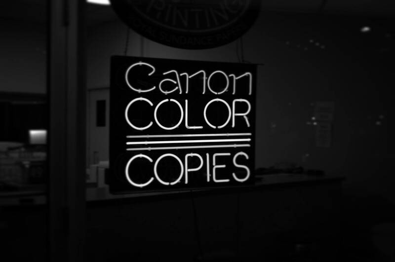
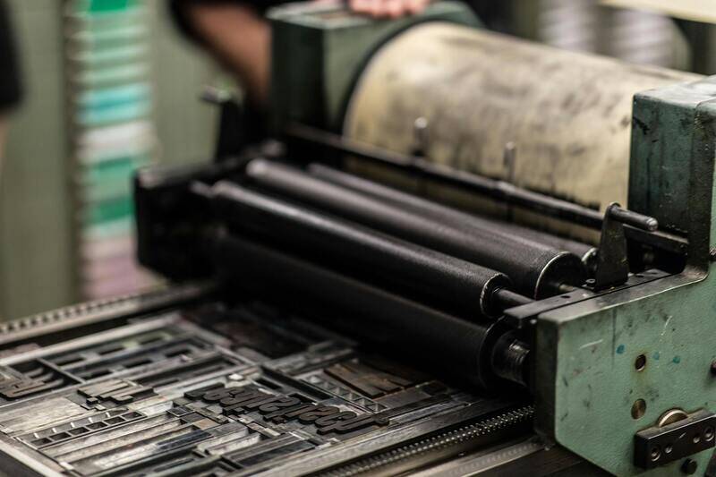
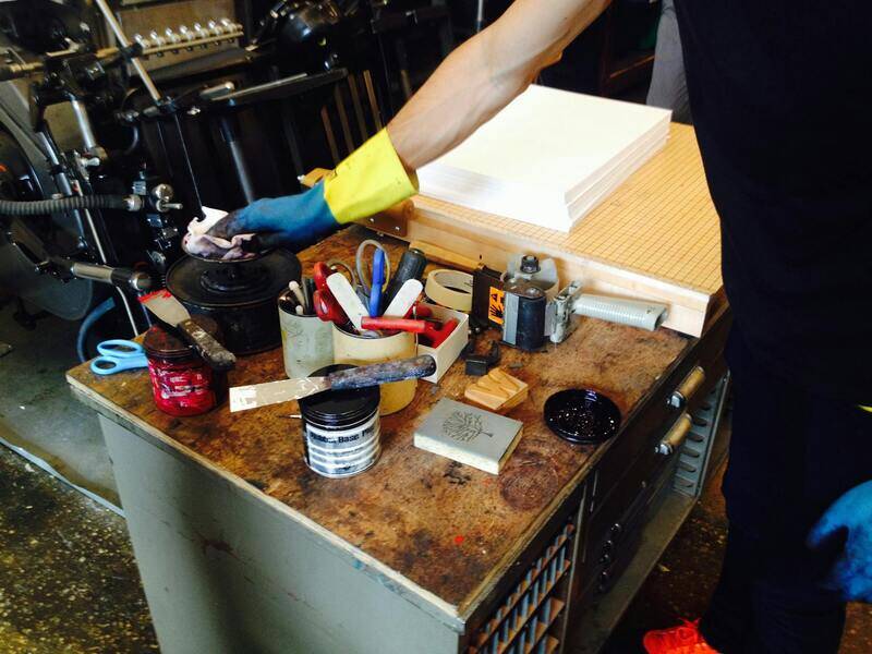
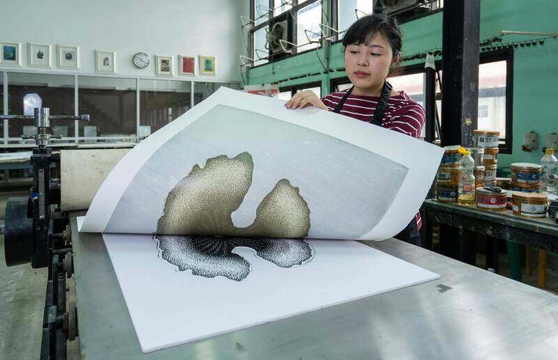
Ensuring High-Quality Printing Techniques and Material Selection
Choosing the appropriate printing techniques and premium materials plays a crucial role in producing business cards that effectively convey professionalism and attention to detail. When selecting a printing method, it is vital to consider options that support your design's intricacy and desired finish. For example, offset printing is renowned for its high fidelity and consistency, making it ideal for large quantities with complex designs, while digital printing offers flexibility for short runs or personalized cards. Each method impacts the final appearance and tactile quality of the card, influencing how recipients perceive your brand.
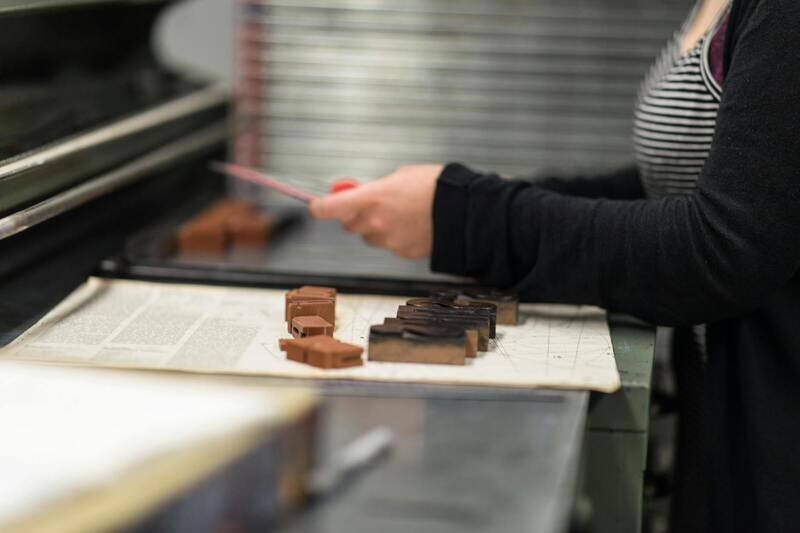
Material selection also greatly impacts durability and aesthetic appeal. A broad spectrum of paper types ranges from standard cardstock to luxurious options like textured, matte, gloss, or coated finishes. Thicker papers, such as 350 gsm or higher, tend to convey a sense of sturdiness and premium quality, reinforcing the perceived value of your brand. Specialty papers, including linen, felt, or pearl finishes, add tactile richness and visual interest that can make your business card stand out amid competitors.
Factors to Consider When Choosing Printing Methods and Materials
- Design Complexity: Intricate graphics or fine linework may require offset or high-resolution digital printing to preserve detail.
- Quantity: Large orders often benefit from more cost-effective offset printing, whereas small batches might be better suited for digital solutions.
- Finish and Texture: Matte, gloss, or textured surface options can complement your brand’s identity and create tactile appeal.
- Durability Requirements: Consider weather-resistant or coated papers if your cards will endure frequent handling.
- Budget Constraints: Balancing quality with affordability ensures your cards look impressive without exceeding your financial plan.

Careful evaluation of these factors guarantees that your business cards not only visually represent your brand but also withstand everyday use, leaving a lasting impression on recipients. Collaborating with a reliable printing service that offers a variety of options ensures your final product aligns perfectly with your branding goals and audience expectations. The combination of premier printing techniques and premium materials will elevate the perceived value of your business cards, fostering trust and recognition among potential clients and partners.
Understanding Business Card Design Fundamentals
Creating an effective business card requires a clear grasp of core design principles that align with your brand image and communication goals. The foundational elements include thoughtful layout, typography, color schemes, and overall visual hierarchy. A well-structured layout ensures that all key information is presented logically, making it easy for recipients to find contact details, job titles, and your company's tagline. Typography choices should complement your brand personality, whether that's modern, professional, or creative, while ensuring readability at a glance. Color schemes play a vital role in conveying your brand’s identity—selecting hues that evoke the appropriate emotions and align with your existing branding enhances recognition.
Effective use of negative space prevents the design from appearing cluttered, allowing your key messages to stand out. Incorporating grid systems ensures consistency across various design elements, fostering a polished, professional appearance. Balancing these fundamentals results in a business card that not only looks appealing but also effectively communicates your brand message. When designing, consider how your card will be perceived in the hands of potential clients or partners, aiming for a visual style that resonates trustworthiness and competence.
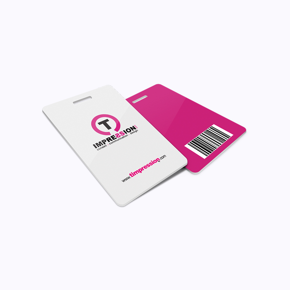
Choosing the Right Materials and Paper Types
The tactile quality of your business card significantly influences its perceived value. Selecting appropriate materials and paper types is essential for aligning with your brand identity and ensuring durability. Standard options include matte, gloss, silk, and textured finishes, each offering distinct sensory experiences. Matte finishes provide a modern, subdued look with excellent readability, especially for cards that feature detailed graphics or text. Gloss finishes enhance color vibrancy, making imagery and logos pop, which is ideal for visually-driven brands.
Textured papers, such as linen or felt, lend a tangible richness that can elevate your card’s appearance, conveying sophistication or artisanal craftsmanship. Pearl and metallic papers introduce a subtle shimmer, adding a touch of luxury and making your business card more eye-catching. When selecting materials, consider the environment in which your cards will be handled—weather-resistant or coated options can withstand frequent use and exposure to elements.
Incorporating high-quality paper types not only enhances aesthetics but also reinforces your brand’s message of professionalism. When paired with the right printing technique, such as digital or offset printing, the choice of materials ensures a crisp, vibrant result that remains intact over time. It is advisable to collaborate with a trusted printing service that offers a broad range of options, allowing you to customize the tactile and visual appeal of your business cards effectively.
Ensuring Consistency Through Proper File Preparation and Color Management
Achieving a polished and professional look in your business card design heavily depends on meticulous file preparation and effective color management. When submitting your artwork to a printer, it is essential to use the correct file formats, typically high-resolution PDFs, TIFFs, or EPS files, that preserve the integrity of your design elements. Ensuring that all text is outlined or converted to vector shapes prevents font discrepancies or substitutions during printing, safeguarding brand consistency.
Color accuracy is equally vital. It is recommended to work within a standardized color space, such as CMYK, which aligns with most professional printing processes. Embedding color profiles into your design files ensures that your colors remain consistent across different devices and mediums. Consulting with your printing provider about their preferred color profiles and proofing methods can help you anticipate and correct any color shifts, resulting in business cards that exactly match your branding expectations.

In addition to technical considerations, performing test prints or digital proofs provides an overview of how your final product will look. These previews can help identify potential issues with color, layout, or image resolution before committing to a full print run. Revisions based on these proofs allow for adjustments that enhance the overall quality of your business cards.
Choosing Reliable Printing Partners for High-Quality Results
Partnering with reputable printing service providers is fundamental to ensuring that your business cards meet high standards of quality. Trusted printers employ advanced printing technologies such as offset, digital, or hybrid methods, each suited for different design complexities and quantities. Offset printing, for example, is ideal for large runs, offering excellent color fidelity and sharpness, whereas digital printing provides faster turnaround times and customization options suitable for smaller quantities.
Experience and technical expertise of the printing team play a significant role in producing business cards that align perfectly with your design specifications. Reliable providers also offer guidance on material options, finishes, and special effects, ensuring your final product not only reflects your brand identity but also stands out visually and tactilely.
When selecting a printing partner, review their portfolio, customer testimonials, and available services. Clear communication regarding your design, preferred materials, and desired finishes facilitates a smooth production process. Requesting samples or proofs before full production allows you to inspect the quality firsthand and make any necessary adjustments.
Ensuring that your business cards are produced with precision and high-quality materials translates into a lasting impression on your contacts. The investment in proper file preparation, color fidelity, and choosing the right printing partner ultimately elevates your brand presence and reinforces professional credibility.
Utilizing Official Resources and Industry Guidelines for Design Integrity
Crafting a professional and impactful business card requires adherence to industry standards and leveraging legitimate sources of inspiration. Reputable design templates and official style guides provide a framework that ensures your card aligns with current best practices and maintains a polished appearance. Accessing licensed graphic assets and adhering to predefined color schemes enhances consistency and brand recognition.
Consulting established design guidelines from professional organizations helps in understanding parameters such as readability, contrast, and visual hierarchy. These standards serve as benchmarks for creating cards that are both visually appealing and functionally effective, facilitating clear communication of your contact details and brand identity.

Verification of Design Elements and Compliance
Ensuring your business card design adheres to established norms involves verifying each element through official design tools and resources. Use font libraries and vector graphics from authorized providers to prevent issues related to copyright infringement. Incorporating design software that complies with licensing agreements guarantees that your project remains within legal parameters.
Additionally, conforming to printing standards—such as proper bleed areas, safe zones, and color profiles—affects the final output's quality and durability. Many professional printers and online platforms offer templates and guidelines that facilitate conformity, which can be cross-verified with standard industry documentation.
Maintaining Portfolio and Sample Validation
For accuracy and quality validation, rely on verified sample portfolios and official product catalogs. Reviewing tangible examples of high-quality business cards, issued by credible vendors, provides insight into material choices, finishes, and craftsmanship. This examination aids in making informed decisions about your design and material selection, ensuring the final product meets the necessary standards.

Engaging with Certified Printing Partners
Partnering with officially recognized printing services—who operate under industry-certified standards—guarantees the accurate reproduction of your approved design. These providers utilize validated workflows and quality assurance protocols, resulting in consistent outcomes. Confirming their certifications or industry affiliations fosters confidence that your cards will be produced and finished to the highest legitimate standards.
Clear communication about your design specifications, along with the submission of properly prepared files—such as vector formats and color proofs—ensures adherence to official guidelines throughout the printing process.
Maintaining Consistency with Official Printing Standards
To ensure your business cards are produced to the highest standard, it is crucial to work with printing facilities that adhere strictly to official industry guidelines. Such providers utilize certified workflows, validated color management systems, and quality control measures that conform to recognized standards. Engaging with these sources not only guarantees the authenticity of the process but also minimizes discrepancies and ensures precise reproduction of your design. Additionally, they typically offer detailed file preparation instructions—such as using vector graphics and appropriate color profiles—that align with industry protocols. This structured approach helps maintain accuracy throughout production and preserves the integrity of your branding elements.

Utilizing Verified Sample Portfolios for Quality Assurance
Access to official sample portfolios remains one of the most reliable methods for evaluating potential printing services. Reputable vendors provide tangible examples of previous work, illustrating the quality of materials, finishes, and craftsmanship. By reviewing these samples, you gain insights into how different paper types, coatings, and embellishments appear in real-world applications. This process allows you to compare finishes such as matte, gloss, or textured surfaces and assess how detailed artwork, color vibrancy, and special effects are rendered. Relying on verified samples ensures that your chosen provider can deliver results that meet or exceed industry standards, aligning with your specific design expectations.

Collaborating with Certified Printing Experts
Partnering with officially recognized printing services offers the reassurance of industry certification and adherence to best practices. These certified vendors employ validated workflows, rigorous quality assurance protocols, and certified machinery that contribute to consistent, high-quality output. When engaging with such providers, it is advisable to communicate your design specifications clearly and submit properly formatted files—preferably in vector formats with accurate color proofs. Doing so ensures that the fidelity of your design is maintained throughout the printing process, resulting in a product that faithfully represents your branding vision and fulfills professional standards.